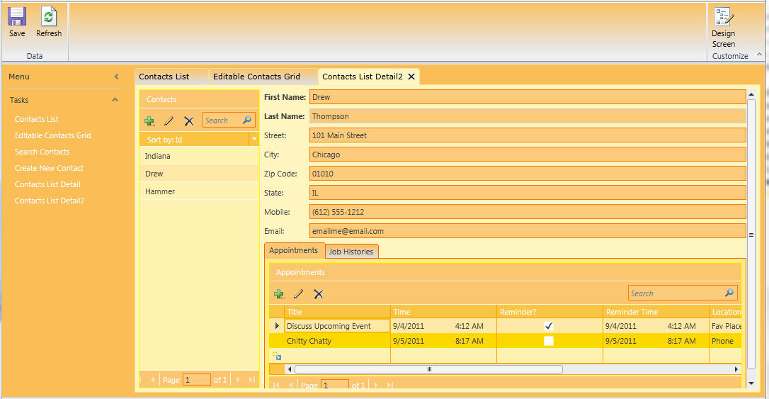
Another theme for variety. This one has a variety of shades of Orange. Please try it out, leave feedback and rate it. If you would rather have it in a different shade, let me know and I will try to accomodate. By the way I have noticed that the actual screens in the app look better than the screen shots depict :). Slightly updated version to change the alternative row background that was used on grids from light blue to another orange (based on feedback). Thank you and Enjoy. Crom. Sample Screen 1: List Detail Screen with Multiple Tabs
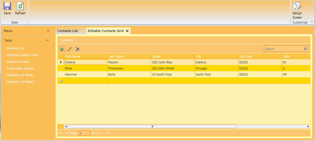
Sample Screen 2: Editable Grid Screen
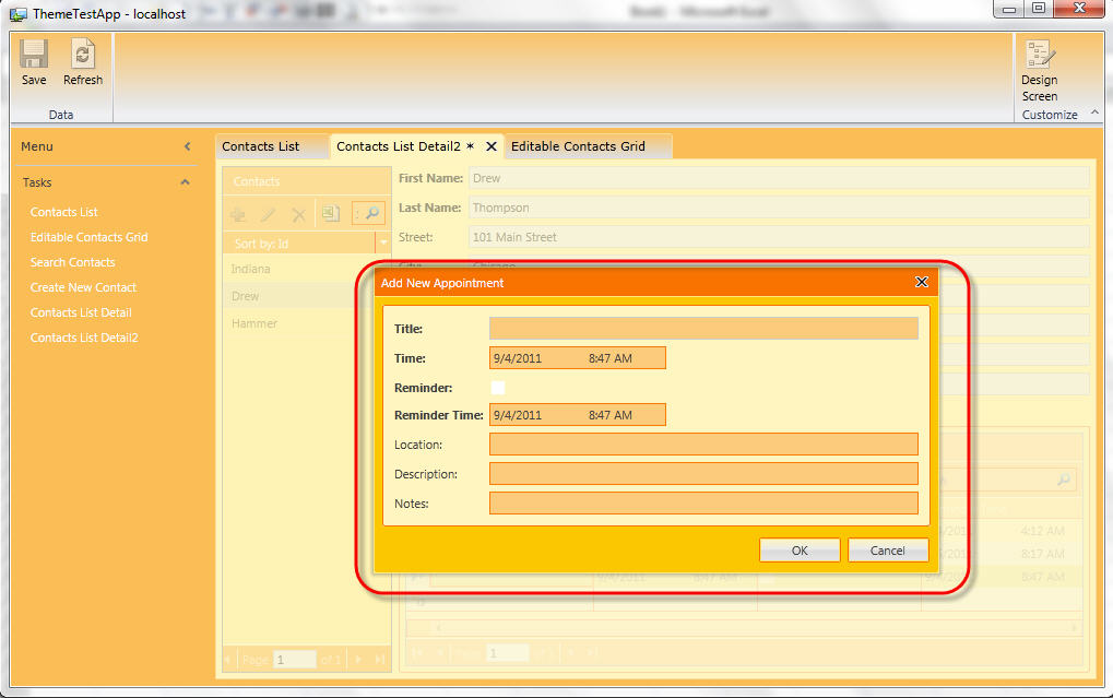
Sample Screen 3: Add/Edit Modal Screen
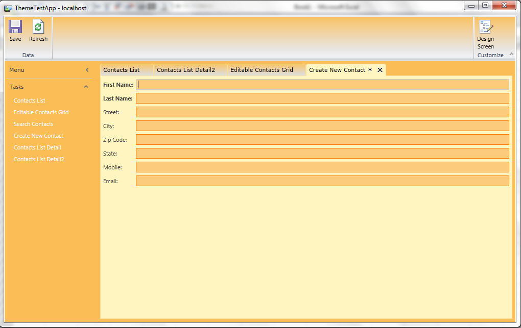
Sample Screen 4: Create New Record Screen
|